Every month, a handful of scheduled data releases reshape the macro landscape: CPI tells the Fed whether inflation is cooling, NFP tells them whether the labour market needs protecting, FOMC decisions move the entire rate curve. Crypto markets — despite the narrative of decentralisation — are deeply sensitive to all of it. The relationship is structural, not coincidental.
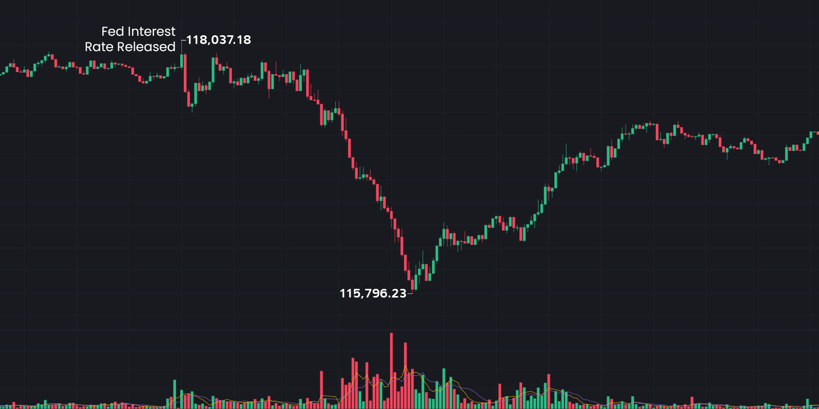
When a CPI print misses consensus, liquidity dries up fast. Leverage gets flushed. BTC can drop 4–6% in under 30 minutes while altcoins move 2–3x that. What looks like chaos has a structure — and that structure is consistent enough across releases to be useful if you know where to look.
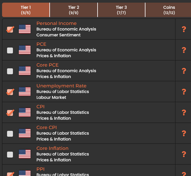
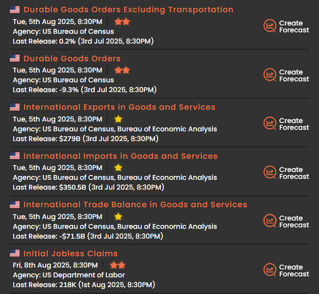
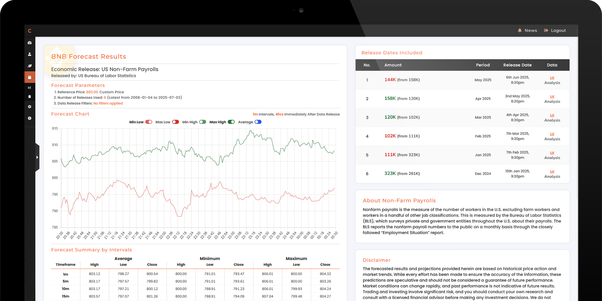
Clometrix was built to surface that structure. For every tracked event — 27 in total — and every supported coin, you get a minute-by-minute chart of historical price behaviour built from Binance kline data going back to 2017. Not a prediction. A calibrated range, grounded in what actually happened.
Start by choosing the events and coins that matter to your trading. Your plan determines how many you can track simultaneously — and you can update your selection periodically, so your setup evolves with your focus.
Events are tiered by historical market impact. Tier 1 — CPI, FOMC, NFP — are the releases that consistently move markets the most. Tier 2 and 3 cover the broader macro calendar: PPI, PCE, retail sales, JOLTS, durable goods, GDP, and more. Some Tier 2 events produce surprising volatility depending on the macro cycle, which is why the tiering is a guide, not a ceiling.
More events and cryptocurrencies are planned, including coverage beyond US macro data. The core platform is built to expand — new releases are added as the data infrastructure is ready.
Pick an event and a coin. From there, you can narrow the analysis — limit it to the last N releases, or filter by data direction (only look at instances where the reading came in above the previous, or below). This lets you model specific scenarios rather than averaging across all outcomes.
Clometrix then pulls the Binance kline data for every matching historical release and builds a composite chart: the median move, the minimum low, the maximum high, and the full spread — plotted minute by minute across the event window. The data source is Binance OHLCV — the same feed professional desks use.
The result is a forecast that reflects how that specific coin has actually behaved around that specific event — not a generic volatility estimate, but a historically calibrated range tailored to what you're trading and when.
The forecast chart gives you the historical floor and ceiling for each event window — the min low and max high across all matching historical releases, alongside the median and the spread. These aren't price targets. They're the boundaries of what the market has done before under similar conditions.
Use the min low as a reference for stop placement. Use the max high as a reference for take profit. Look at where the median sits relative to the current price. Then decide — with actual historical context behind the decision rather than gut feel on a volatile day.
The traders who consistently navigate macro events well aren't smarter — they're more prepared. Clometrix is how you prepare.